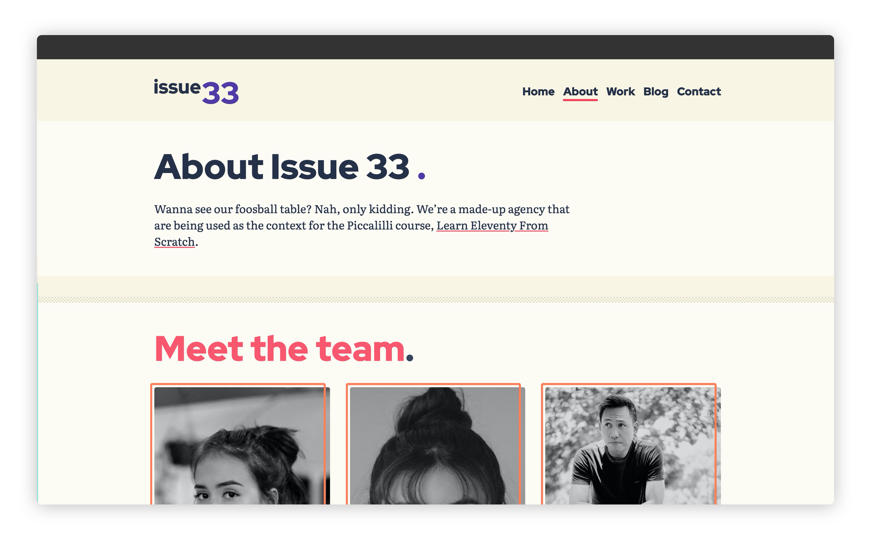
# Lesson 28: Styling the about page
Like the summary says, let’s make this one snappy. We’re nearly at the end of this course now and I bet you’re getting pretty tired, so it’s time for a quick win.
Let’s go!
# Adding an auto-grid utility
The about page is actually pretty much ready to go. All we need to add is styles for the team members. The first part of that is the auto grid that lays out those people items.
I love this upcoming utility and wrote a pretty detailed tutorial about it here on this site (opens new window).
Let’s add the code. Create a new file in your utilities folder called _auto-grid.scss:
/*
  AUTO GRID
  Set the minimum item size with `--auto-grid-min-size` and you’ll
  get a fully responsive grid with no media queries.

  https://piccalil.lihttps://piccalil.li/tutorial/create-a-responsive-grid-layout-with-no-media-queries-using-css-grid/
*/
.auto-grid {
  display: grid;
  grid-template-columns: repeat(auto-fill, minmax(var(--auto-grid-min-size, 16rem), 1fr));
  grid-gap: var(--auto-grid-gap, get-size('500'));
}
If you don’t have time to read the tutorial, I’ll give you a quick TL;DR.
We use the power of minmax and auto-fill to distribute items by filling as much of the viewport as we can. This creates a really handy, fully responsive grid. All of that in 6 lines of code!
Let’s add that to our critical CSS. Open up eleventy-from-scratch/src/scss/critical.scss and on line 94, add the following, with the other utilities @import statements:
@import 'utilities/auto-grid';
# Adding a people block
Now we have that, we’re going to create a compositional block that affects the auto-grid.
Create a new file in your blocks folder called _people.scss and add the following to it:
.people {
  --auto-grid-gap: #{get-size('700')};
}
This is CUBE CSS (opens new window) in a nutshell. We have a utility that does one job and does it well, and a compositional block creates some context for it.
Let’s add that to our critical CSS. Open up eleventy-from-scratch/src/scss/critical.scss and on line 83, add the following, with the other block @import statements:
@import 'blocks/people';
# Adding a person block
We’ve got our people laid out now, so let’s make them look good. Create a new file in your blocks folder called _person.scss and add the following to it:
.person {
  position: relative;
  height: 100%;

  &__details {
    position: absolute;
    bottom: 0.5rem;
    left: -0.25rem;
    width: calc(100% - 0.5rem);
    padding: 0.8rem;
    background: get-color('quaternary');
  }

  &__image {
    filter: grayscale(1);
    width: 100%;
    height: 100%;
    object-fit: cover;
  }

  &__name {
    display: block;
    font-size: get-size('600');
  }
}
What we're doing here is creating an overlay that sits on top of each person’s profile shot. Then, because we're forcing the image to fill 100% of the parent height as some images are taller than others, we use object-fit: cover again to fix the cropping. We make it black and white using the grayscale filter for good measure too.
Let’s add that to our critical CSS. Open up eleventy-from-scratch/src/scss/critical.scss and on line 84, add the following, with the other block @import statements:
@import 'blocks/person';
Now, if you go to http://localhost:8080/about-us (opens new window), it should look like this:

# Wrapping up
That was a quick one wasn’t it? Let’s move straight on to another quick one by adding ourselves a basic contact page.